
How to Match Your Metal Card Design to Your Brand Identity (Without Making It Cringey)
A metal card can be a gorgeous brand artifact. It can also be a loud, expensive mistake.
The difference usually isn’t budget. It’s alignment. If your card feels like it came from the same universe as your website, packaging, product UI, and customer experience, people trust it faster. If it feels like a random “luxury upgrade,” they get suspicious (even if they can’t explain why).
Metal cards aren’t “premium.” They’re specific.
Here’s the thing: “premium” is not a style. It’s a promise.
A brand-aligned metal card communicates quality, reliability, taste, restraint, or power depending on how you build it. Weight, finish, edge detail, even how light rolls across the surface, those are signals. People read them instantly.
And yes, markets read them differently. I’ve seen minimal, matte designs interpreted as “serious and modern” in one region and “cold and inaccessible” in another. If you’re global, don’t assume your personal aesthetic is universal.
Whether you’re designing through Metal Kards or building your own concept from scratch, the point is the same: intention matters.
One-line truth:
Your card is a tiny product experience.
Start with brand cues, not materials
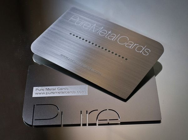
If you begin with “black metal, gold foil,” you’re designing vibes. That’s risky. Start with the brand itself and translate.
Think in three buckets:
– Values: what you actually stand for (not what you wish you stood for)
– Voice: how you sound when nobody’s forcing you to be formal
– Visual system: logo rules, typography, color, imagery, spacing habits
Once you’ve got those pinned, mapping to a metal card gets almost mechanical.
A quick mapping cheat (the kind I actually use)
Brand trait → card decision
Precision → crisp engraving, tight kerning, sharp edge bevel
Warmth → softer type, warmer alloy tones (brass/bronze), rounded corners
Authority → heavier stock, high contrast, minimal copy, disciplined grid
Playfulness → unexpected texture zones, secondary color hits, friendlier microcopy
Now, this won’t apply to everyone, but if your brand guidelines are vague, your metal card will be vague too, just shinier.
The “single source of truth” move that saves projects
You need one canonical list of brand assets that production can’t reinterpret:
Logo files (vector), color definitions, type hierarchy, icon set, imagery rules, tone rules, and what can never change.
Because manufacturing teams will improvise if you leave gaps. Not maliciously, just because metal production demands decisions: etch depth, ink type, protective coatings, tolerances.
I’ve watched beautiful designs collapse at proof stage because nobody specified how a light gray accent should appear on brushed steel. It looked elegant on screen, then vanished in real life.
Finishes, textures, materials: the sensory part of the brand
Hot take: most metal cards overdo the finish. They shout when they should speak.
A finish is not decoration. It’s positioning.
– Brushed metal reads practical, engineered, competent.
– High polish reads flashy (sometimes “expensive,” sometimes “trying too hard”).
– Matte black reads controlled, modern, security-minded.
– Anodized color can feel tech-forward, but cheap fast if the hue is off.
And texture? Texture is basically tone of voice you can touch.
Texture tells the story (even when copy is minimal)
Embossing and debossing are not just “effects.” They’re hierarchy tools. A raised logo becomes a signature. A contrasting texture field becomes a navigation system for the eye.
One warning from experience: competing textures kill each other. If you’re mixing grain + gloss + deep engraving + color fill, you’ve built a demo card, not a brand object.
Layout and typography: don’t let the metal bully your type
Metal surfaces are unforgiving. Reflectivity, micro-scratches, and finish direction all mess with legibility. So you can’t just paste your web typography onto a card and call it consistent.
You need a typographic system that survives manufacturing.
A technical briefing style, because it matters:
– Use clear hierarchy: one primary typeface, one supporting face (optional accent only if you can defend it).
– Watch stroke weight: too thin and it disappears in etching; too heavy and it blobs when ink-filled.
– Keep line lengths sane: 40, 70 characters per line is a useful ceiling for readability on small formats.
– Build spacing like you mean it: margins, baselines, and alignment should feel inevitable, not “centered because… card.”
If your brand voice is confident, let the layout breathe. If your voice is friendly and busy, don’t force brutal minimalism. That mismatch always shows.
“Are you designing a card… or a tiny billboard?”
If you try to cram the whole company onto metal, you’ll get a stiff, desperate object that no one wants to carry.
Use microcopy carefully. Make it sound like you.
A subtle line like “Member since 2026” can feel prestigious or corny depending on font choice and placement. Same words. Different voice.
And iconography matters more than people think: consistent line weight, corner radius logic, and spacing rules make the card feel like it belongs to your product ecosystem.
Color on metal is not the same color (and screens lie)
Your brand palette might look perfect in Figma. Metal doesn’t care.
Light interacts with metal in weird ways: brushed finishes scatter highlights; polished surfaces mirror the environment; matte coatings flatten contrast. So you need a metal-specific color system that still respects your identity.
Give colors roles:
Primary: the “default” brand signal
Secondary: supportive, quieter
Accent: rare, intentional, used for emphasis
Then test under realistic lighting. Office fluorescents. Direct sun. Dim restaurant light (the real-world scenario everyone forgets).
A useful data point: humans respond to color extremely fast, within fractions of a second. One widely cited finding is that people form an impression in as little as 90 seconds, and color can account for a large portion of that snap judgment (often cited as up to 62, 90% depending on context). Source: CCIC / Satyendra Singh, “Impact of color on marketing,” Management Decision (2006). Color choices on metal are absolutely part of that first-impression math.
Consistency across touchpoints: prove it, don’t assume it
Designing is guessing. Testing is knowing.
Run consistency checks across:
Digital mockups → proof samples → production batches → real handling
And don’t just look at it head-on. Tilt it. Fingerprint it. Scratch-test a corner. See what happens after a week in a wallet.
Look, a metal card that looks perfect only in studio lighting is basically a concept car. Pretty. Useless.
Production realities (where good branding goes to die, unless you plan)
This part is less glamorous, but it’s the difference between “wow” and “why does it look cheap?”
Plan for:
– Tolerances: edge finishing, cut precision, alignment drift
– Engraving depth: too shallow fades; too deep can trap grime
– Coatings: protect against corrosion and scratches, but can shift color
– Batch variation: especially with anodizing and color fills
– Supplier capability: not every vendor can hit tight brand color targets reliably
Opinionated note: choose suppliers who talk about repeatability, not just “quality.” Anyone can make one beautiful sample. Brands live in the 5,000-unit reorder.
Document decisions. Version everything. If you change a finish, record why. Future-you will thank you when marketing asks for a “small update” that accidentally breaks the whole system.
A brand-aligned metal card should feel… inevitable
Not trendy. Not overdesigned. Not like it’s compensating.
When it’s right, people don’t say, “Nice metal card.” They say, “Of course you have a card like this.” That’s the goal.